Microsoft launched a iOS version of the popular OneNote software. Back when I was using Windows, I remember feeling pretty impressed by its functionality and ease of use
 .
.
I was curious to see if Microsoft had pushed any envelope / come up with something cool in terms of user-interface (The Ribbon interface, anyone?), so like any good kid, I installed the app from the app store. I still haven’t gotten to use it and the sign up process turned out to have as many roadblocks as you can possibly imagine. In effect, it seems that the signup was a hurried afterthought, not at all designed for the mobile platform. There is no clear and frictionless path to signup, no sense of instant gratification for the user.
Let me explain further:
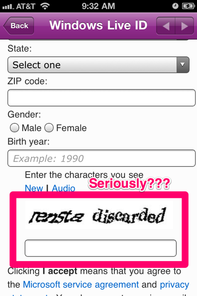
When you try to sign up, it seems to display a web-page based form, as opposed to a native form. There is nothing wrong with this, especially, if it gets you to market quickly. But wait, the form is not designed for a mobile app. It has a captcha! Lets just make people type more in their virtual or tiny keyboards.

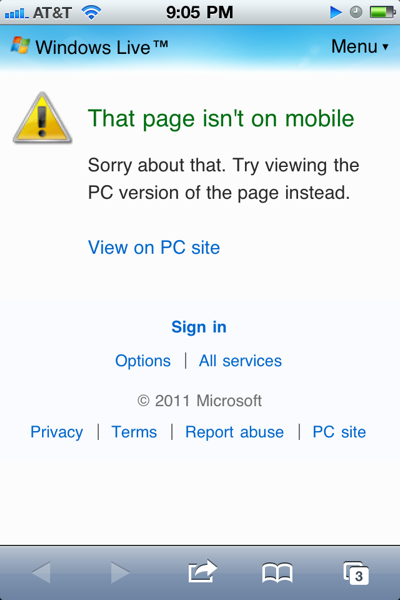
Being the relentless guy that I am, I went through with it, and signed up. But wait, I first am going to have to confirm my registration using a link that was sent to the email address I provided. I need to switch apps, and unless I am really motivated, I probably wont come back to it. But I was. So I switch to my Mail Client, opened the email, and clicked the confirmation link only to find out that the link cannot be activated on a mobile platform.

Fail, Fail, and Fail. Next.